Taormina Wealth Management
Work
Tools
Adobe Illustrator
Adobe Photoshop
Overview
Taormina Wealth Management is a financial advising firm specializing in retirement investment services. The client came to me seeking a 360º brand concept that could authentically represent their organic, personalized approach while giving the firm a distinct market position and sense of personal flair.
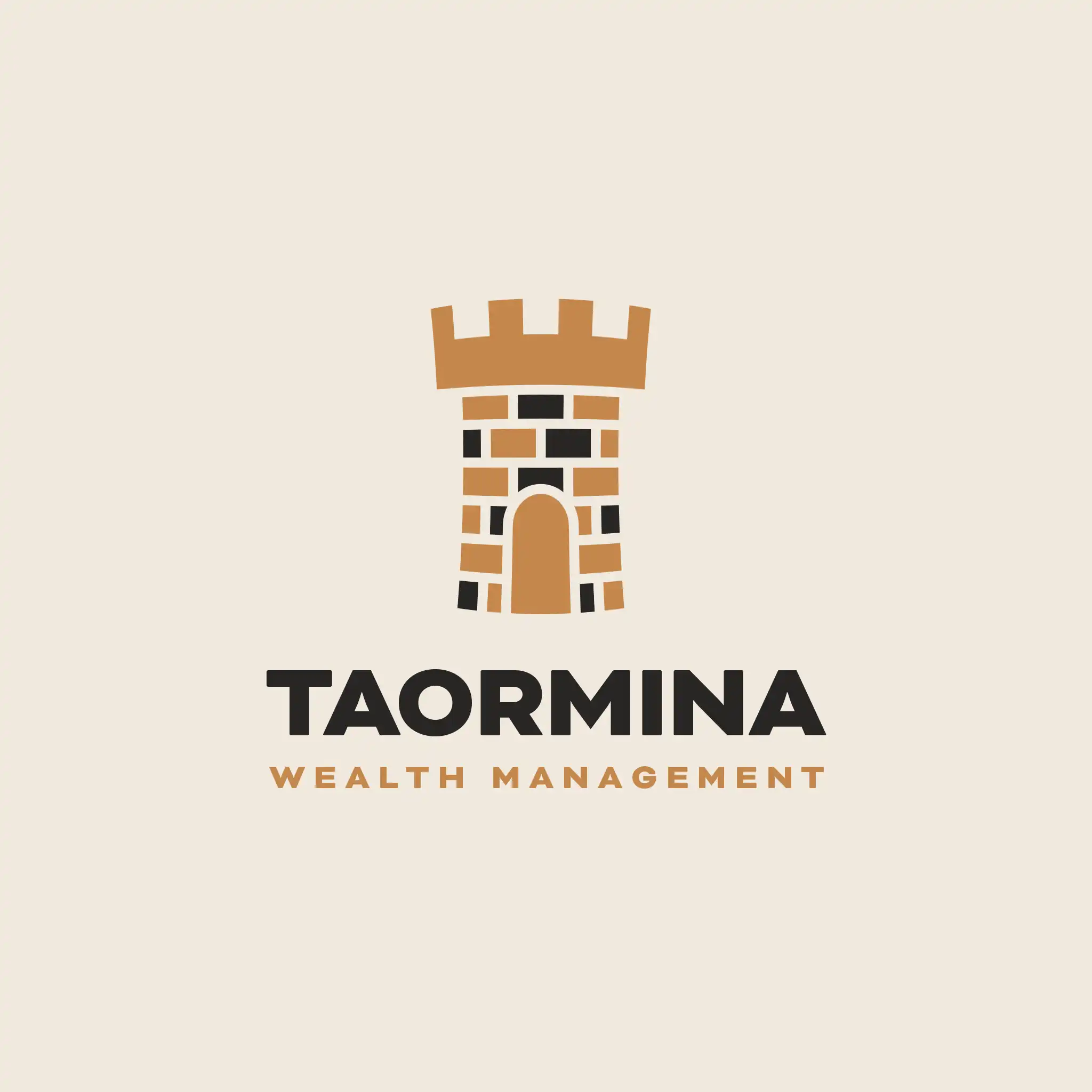
The “turret” logo mark was designed to represent a solid, trustworthy foundation — something clients could build trust and wealth upon. It needed to work at every scale while feeling bold, elegant, and appropriate for the firm’s audience. The concept reflects the idea that working with Taormina means being in good hands: shielding assets from harm while helping fortify them for the future.
The color palette evokes class, elegance, and trustworthiness.
Almond communicates a fresh, clean, and calming quality, helping clients feel grounded in where they are.
Miele brings a sense of wellbeing and emotional steadiness to a field where stress can be ubiquitous.
Rocca adds a deep, sophisticated tone that feels sturdy, solid, and enduring.
The selected typeface, Bicyclette, supports the honest and trustworthy intent of the identity. Paired with the overall look and feel of the marketing materials, it creates a modern take on midcentury styling while reinforcing the belief that the firm has its clients’ backs.
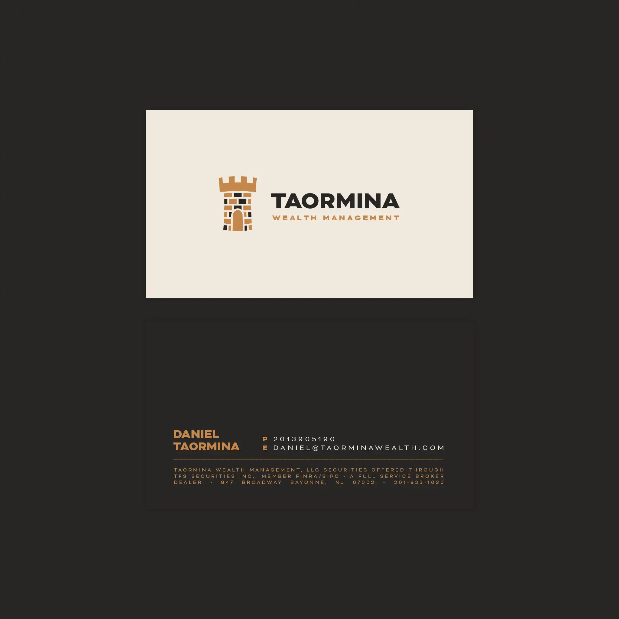
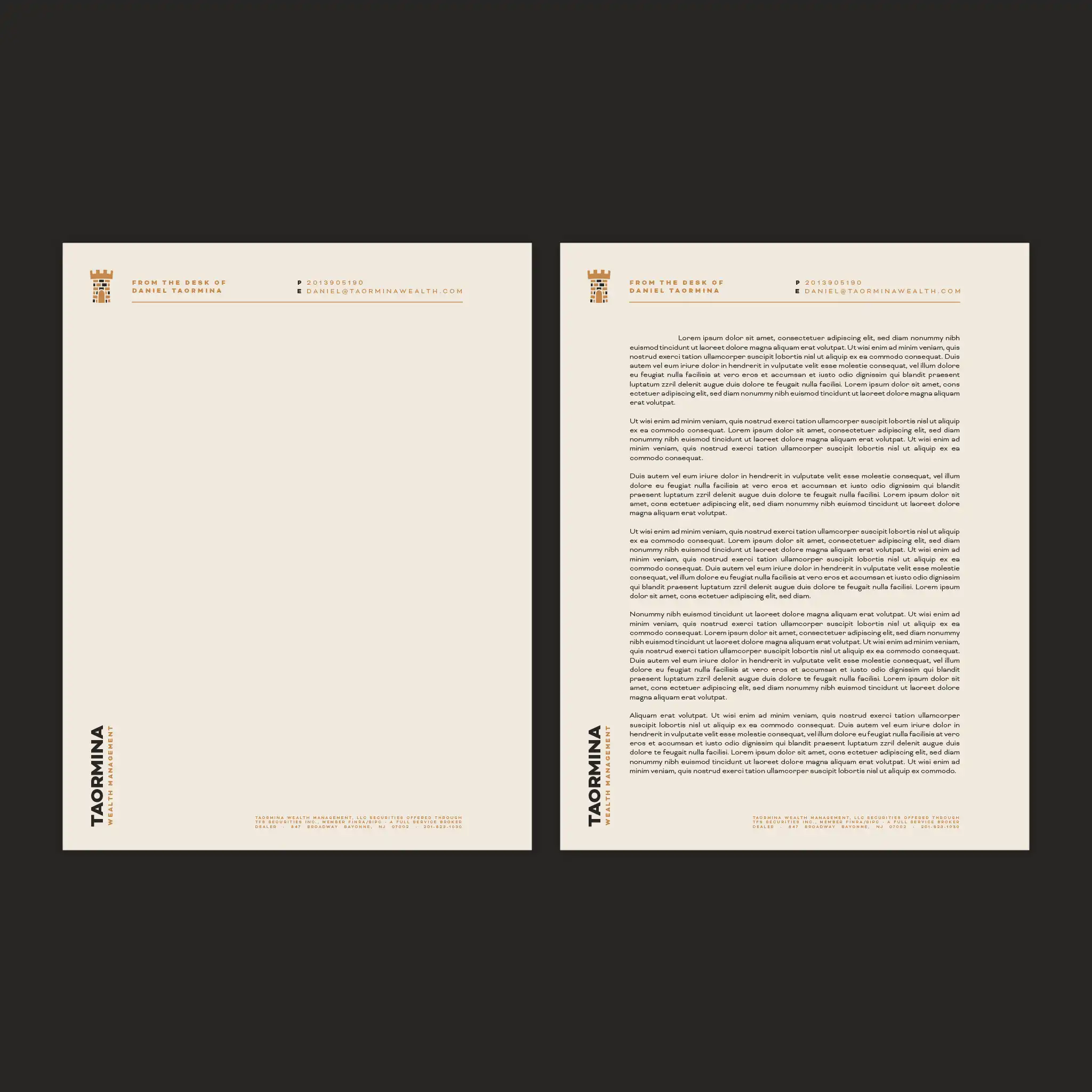
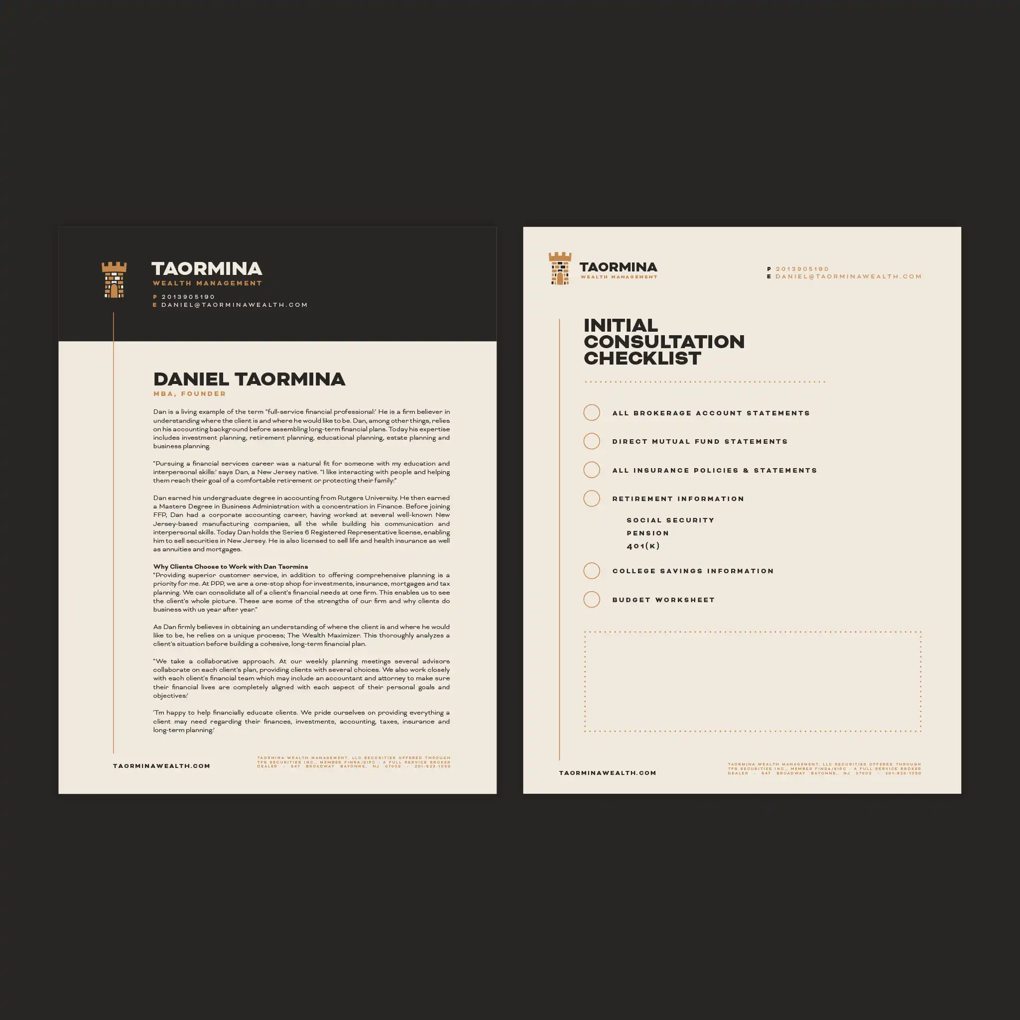
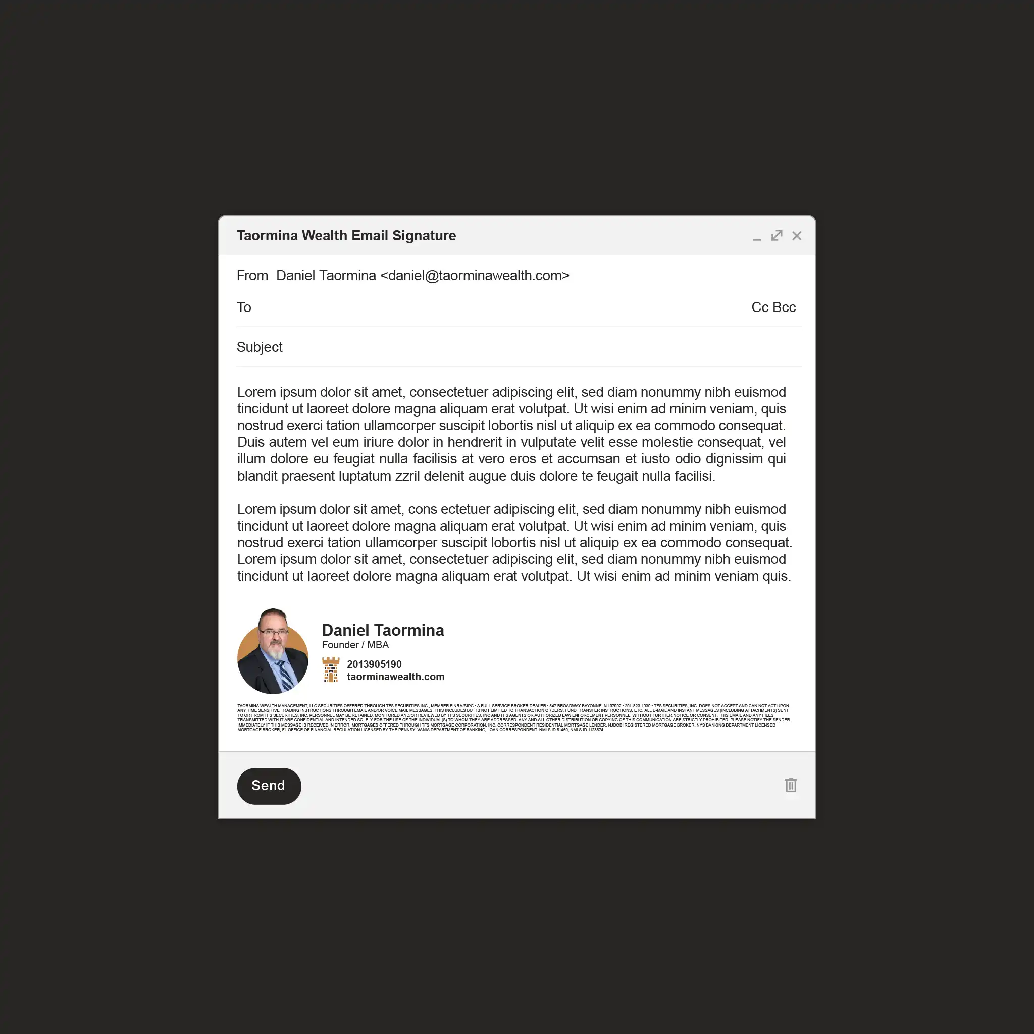
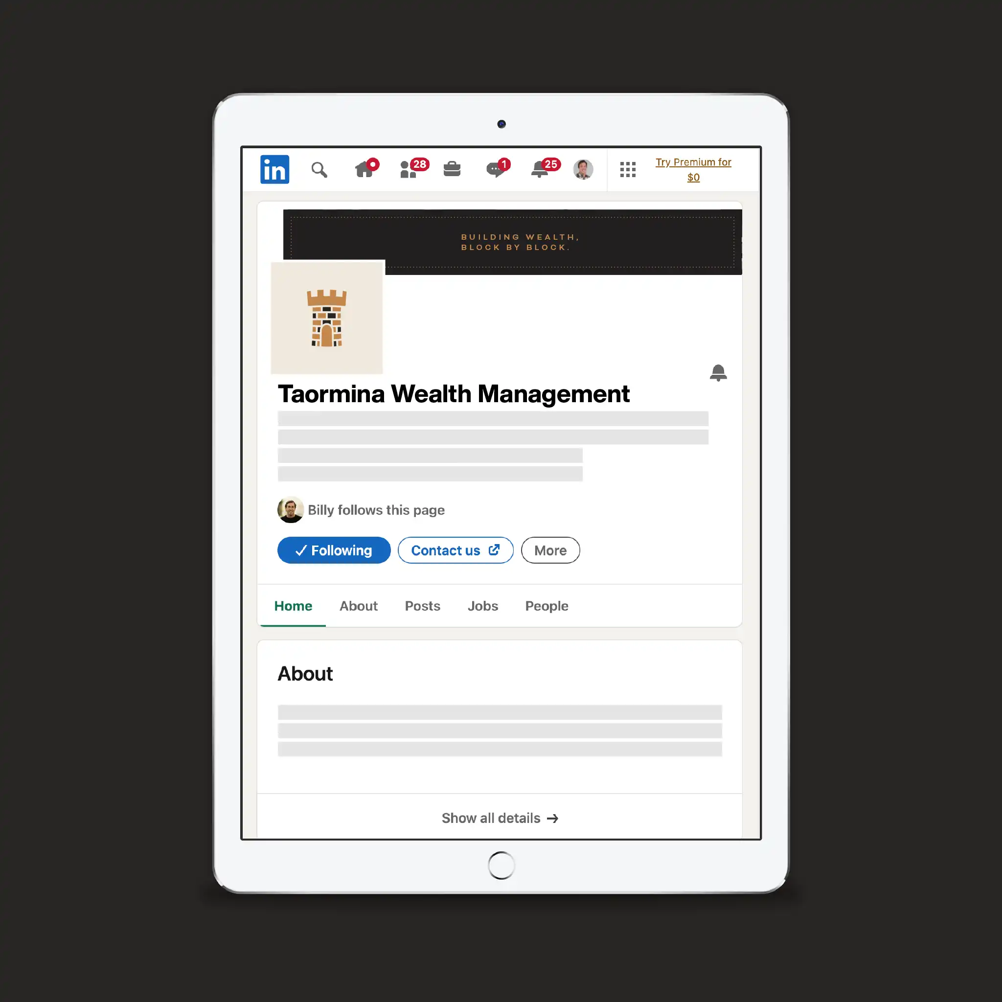
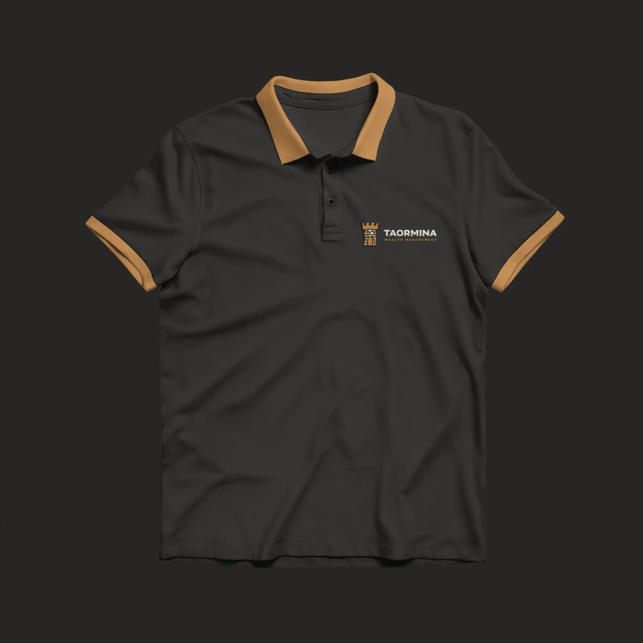
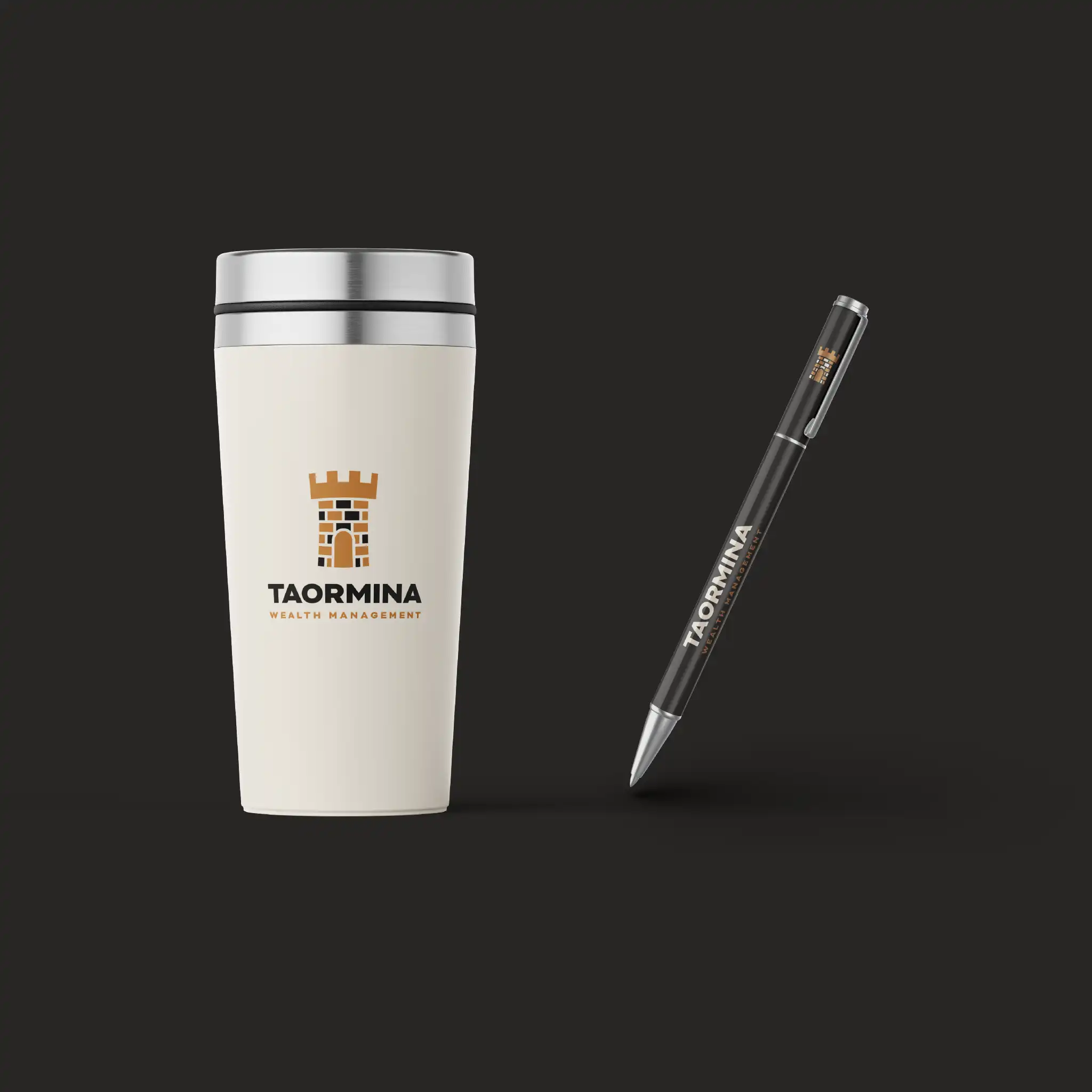
For this project, I designed the logo mark and wordmark, brand color palette, tagline with supporting styling, and broader visual direction. I curated the typeface, hand-selected the colors, and designed the marketing materials, including letterhead, a one-pager, client checklist, email signature, social branding, uniform shirt, and swag.